Matt and Sean had a clear idea of their brand, we worked closely with them to develop branding that encapsulated their vision.
A brand focused on green energy
Our Approach
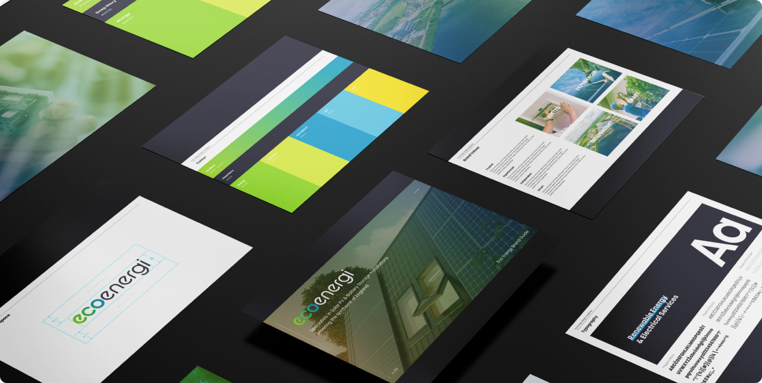
Matt and Sean approached us when dissatisfied with another design. We undertook the task of crafting branding for their new venture. Understanding their preferences, we delved into solar energy themes, steering clear of colours like orange that might evoke heating rather than electricity.
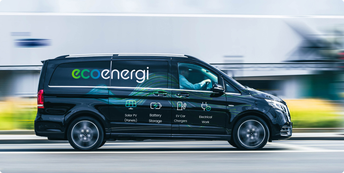
We introduced several options, with the half-gradient logotype picked as the winner. Its sleek appearance against black or white backgrounds resonated with their preference for a clean look. Simultaneously working on their website, we meticulously selected typefaces, complementary colours, and iconography to ensure a seamless brand identity across all media.
Matt and Sean approached us when dissatisfied with another design. We undertook the task of crafting branding for their new venture. Understanding their preferences, we delved into solar energy themes, steering clear of colours like orange that might evoke heating rather than electricity.
We introduced several options, with the half-gradient logotype picked as the winner. Its sleek appearance against black or white backgrounds resonated with their preference for a clean look. Simultaneously working on their website, we meticulously selected typefaces, complementary colours, and iconography to ensure a seamless brand identity across all media.