
Did you know that it only takes a user 50 milliseconds to form an opinion on your website? From that first click users are deciding whether to leave or stay and we want them to stay. This is why every pixel and colour choice is incredibly important in web design. But, how can you use colour to leverage your site’s credibility and encourage users to stay? That is where colour psychology comes in.
Why does red command my attention? And other colours make me feel….
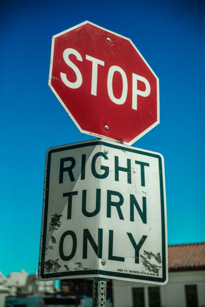
You have probably noticed when you are driving that the stop signs are red, road closure signs are red, even that annoying flashing dot reminding you of the pile of unread emails is always red. Anything that needs your attention is in red. But, why?
Historically, as humans we have always viewed red with danger like blood and fire. If we saw either of those things back in the day we automatically knew we should run in the other direction. As a result this has become an evolutionary trait.
Marketers and designers have since figured out how colour psychology can be used in marketing. We can use the psychological impact of the colour red to drive consumer behaviour. That is why sale signs, clearance events, and urgent calls-to-action are in red. Even buttons on websites that say “Buy Now” or “Sign Up”, are in red.
The Role of Other Colours
Whilst red is the most commonly used colour to evoke emotion, other colours also have their own impacts. What does the colour blue represent and what are the other colour meanings?
- The colour psychology of Blue is known for its calming effect and to convey trust and reliability. It doesn’t have urgency but because it is often used in moments that require focus and productivity, it is great for corporate websites.
- The colour psychology of Yellow is typically used in caution signs and warnings. It signals alertness and catches attention quickly without the urgency red gives.
- The colour psychology of Green is also on the traffic lights you see when you’re out and about to indicate go-ahead actions, creating a sense of calmness and assurance.
- The colour psychology of Orange is energetic and attention grabbing colour so it often evokes enthusiasm and prompts actions. Albeit with less urgency than red but it still has happy connotations.
The Role of Colour in Web Design
Since colours influence emotions, perceptions and behaviours, it becomes a fundamental element in your website’s design. To create credibility and trust between you and the user, it is best to use colours that go with your brand identity. This will help build recognition for your brand.
For example, the website colour scheme by a financial institution like Barclays focuses on the colour blue with elements of white. The blue shows trust and reliability, combined with the white shows that the company is pure and transparent.
But if you look at The Bay Talland website, you can see the use of the colour blue shows a cohesive brand identity whilst evoking a calm, relaxed feeling. They want their audience to feel the relaxation and unwinding they can do at their holiday cottages by Cornwall’s blue sea on a sunny day. That is why your colours have to be relevant to what you are trying to sell or encourage people to do.
Add bright colours to Call-To-Action buttons
By adding a bright colour to buttons like ‘Sign Up’ or ‘Contact Us’ you make them more noticeable and eye-catching. You are more likely to improve your conversion rate optimisation. Even by hanging the colour when a mouse hovers over it will encourage users to click.
Remember, first impressions matter. To be successful in your web design you must use colour with thought and intention to create that meaningful and impactful user experience within the first 50 milliseconds. Understanding the emotional and psychological effects of different colours, you can create a visually appealing and effective website that resonates with your target audience, enhances user experience, and drives those desired actions.
Once you have got your website design portfolio up and running, make sure you use SEO to enhance your UX design, making sure your newly coloured site reaches the top pages of Google. Don’t forget that there are more to the fundamentals of web design so make sure you check out our other blogs for more information.
At Colewood Digital we know your website matters, so Contact Us today for your FREE web design consultation and SEO audit to drive your site up where it belongs.